Tables
addTable(): rows, column widths, merges, borders, fills and auto-paging.
0Namespaces used by the C# samples
using NetCorePpt;                  // PptxGen, Slide
using NetCorePpt.CoreInterfaces;   // option objects: TextProps* / ShapeProps / ImageProps / TableProps / HAlign / VAlign ...
using NetCorePpt.CoreEnums;        // ShapeType, ChartType, MediaType, ShadowType, BulletType, DashType, SCHEME_COLORS ...
using TableRow = System.Collections.Generic.List<NetCorePpt.CoreInterfaces.TableCell>;
Tables and content can be added to Slides.
Usage
PptxGenJS · typescript
// TABLE 1: Single-row table
let rows = [["Cell 1", "Cell 2", "Cell 3"]];
slide.addTable(rows, { w: 9 });

// TABLE 2: Multi-row table
// - each row's array element is an array of cells
let rows = [["A1", "B1", "C1"]];
slide.addTable(rows, { align: "left", fontFace: "Arial" });

// TABLE 3: Formatting at a cell level
// - use this to selectively override the table's cell options
let rows = [
    [
        { text: "Top Lft", options: { align: "left", fontFace: "Arial" } },
        { text: "Top Ctr", options: { align: "center", fontFace: "Verdana" } },
        { text: "Top Rgt", options: { align: "right", fontFace: "Courier" } },
    ],
];
slide.addTable(rows, { w: 9, rowH: 1, align: "left", fontFace: "Arial" });
NetCorePpt · C#
// PptxGenJS writes rows as a jagged array; the C# port exposes the global alias
//   global using TableRow = System.Collections.Generic.List<NetCorePpt.CoreInterfaces.TableCell>;
// so `List<TableRow>` is `List<List<TableCell>>`. Declare the alias in your own file
// (aliases do not flow across assemblies), or spell the type out.

// TABLE 1: Single-row table
var rows1 = new List<TableRow> { new TableRow { "Cell 1", "Cell 2", "Cell 3" } };
slide.addTable(rows1, new TableProps { w = 9 });

// TABLE 2: Multi-row table
// - each row's array element is an array of cells
var rows2 = new List<TableRow> { new TableRow { "A1", "B1", "C1" } };
slide.addTable(rows2, new TableProps { align = HAlign.left, fontFace = "Arial" });

// TABLE 3: Formatting at a cell level
// - use this to selectively override the table's cell options
var rows3 = new List<TableRow>
{
    new TableRow
    {
        new TableCell { text = "Top Lft", options = new TableCellProps { align = HAlign.left,   fontFace = "Arial" } },
        new TableCell { text = "Top Ctr", options = new TableCellProps { align = HAlign.center, fontFace = "Verdana" } },
        new TableCell { text = "Top Rgt", options = new TableCellProps { align = HAlign.right,  fontFace = "Courier" } },
    },
};
slide.addTable(rows3, new TableProps { w = 9, rowH = 1, align = HAlign.left, fontFace = "Arial" });
Usage Notes
- Properties passed to
addTable()apply to every cell in the table - Selectively override formatting at a cell-level by providing properties to the cell object
Cell Formatting
- Table cells can be either a plain text string or an object with text and options properties
- When using an object, any of the formatting options above can be passed in
optionsand will apply to that cell only - Cell borders can be removed (aka: borderless table) by using the 'none' type (Ex:
border: {type:'none'}) - Bullets and word-level formatting are supported inside table cells. Passing an array of objects with text/options values
as the
textvalue allows fine-grained control over the text inside cells. - Available formatting options are here: Text Props
Row Height
- Use the
hproperty to have row(s) divided evenly across the defined area - Use the
rowHproperty with an array of values to specify row heights (indexed 0-n) - Omit both properties to have table rows consume only the space required for its contents
Properties
Position/Size Props ( PositionProps )
| Option | Type | Default | Description | Possible Values |
|---|---|---|---|---|
x | number | 1.0 | hor location (inches) | 0-n |
x | string | hor location (percent) | 'n%'. (Ex: {x:'50%'} middle of the Slide) | |
y | number | 1.0 | ver location (inches) | 0-n |
y | string | ver location (percent) | 'n%'. (Ex: {y:'50%'} middle of the Slide) | |
w | number | 1.0 | width (inches) | 0-n |
w | string | width (percent) | 'n%'. (Ex: {w:'50%'} 50% the Slide width) | |
h | number | 1.0 | height (inches) | 0-n |
h | string | height (percent) | 'n%'. (Ex: {h:'50%'} 50% the Slide height) |
Table Layout Options ( ITableOptions )
| Option | Type | Description | Possible Values (inches or percent) |
|---|---|---|---|
colW | integer | width for every column | Ex: Width for every column in table (uniform) 2.0 |
colW | array | column widths in order | Ex: Width for each of 5 columns [1.0, 2.0, 2.5, 1.5, 1.0] |
rowH | integer | height for every row | Ex: Height for every row in table (uniform) 2.0 |
rowH | array | row heights in order | Ex: Height for each of 5 rows [1.0, 2.0, 2.5, 1.5, 1.0] |
Table Formatting Props ( ITableOptions )
| Option | Type | Unit | Default | Description | Possible Values |
|---|---|---|---|---|---|
align | string | left | alignment | left or center or right | |
bold | boolean | false | bold text | true or false | |
border | object | cell border | object with type, pt and color values. (see below) | ||
border | array | cell border | array of objects with pt and color values in TRBL order. | ||
color | string | text color | hex color code or scheme color constant. Ex: {color:'0088CC'} | ||
colspan | integer | column span | 2-n. Ex: {colspan:2} (Note: be sure to include a table w value) | ||
fill | string | fill/bkgd color | hex color code or scheme color constant. Ex: {color:'0088CC'} | ||
fontFace | string | font face | Ex: {fontFace:'Arial'} | ||
fontSize | number | points | font size | 1-256. Ex: {fontSize:12} | |
italic | boolean | false | italic text | true or false | |
margin | number | points | margin | 0-99 (ProTip: use the same value from CSS padding) | |
margin | array | points | margin | array of integer values in TRBL order. Ex: margin:[5,10,5,10] | |
rowspan | integer | row span | 2-n. Ex: {rowspan:2} | ||
underline | boolean | false | underline text | true or false | |
valign | string | vertical alignment | top or middle or bottom (or t m b) |
Table Border Options ( IBorderOptions )
| Option | Type | Default | Description | Possible Values |
|---|---|---|---|---|
type | string | solid | border type | none or solid or dash |
pt | string | 1 | border thickness | any positive number |
color | string | black | cell border | hex color code or scheme color constant. Ex: {color:'0088CC'} |
Table Auto-Paging
Auto-paging will create new slides as table rows overflow, doing the magical work for you.
Table Auto-Paging Options ( ITableOptions )
| Option | Default | Description | Possible Values |
|---|---|---|---|
autoPage | false | auto-page table | true or false. Ex: {autoPage:true} |
autoPageCharWeight | 0 | char weight value (adjusts letter spacing) | -1.0 to 1.0. Ex: {autoPageCharWeight:0.5} |
autoPageLineWeight | 0 | line weight value (adjusts line height) | -1.0 to 1.0. Ex: {autoPageLineWeight:0.5} |
autoPageRepeatHeader | false | repeat header row(s) on each auto-page slide | true or false. Ex: {autoPageRepeatHeader:true} |
autoPageHeaderRows | 1 | number of table rows that comprise the headers | 1-n. Ex: 2 repeats the first two rows on every slide |
newSlideStartY | starting y value for tables on new Slides | 0-n OR 'n%'. Ex:{newSlideStartY:0.5} |
Auto-Paging Property Notes
autoPage: allows the auto-paging functionality (as table rows overflow the Slide, new Slides will be added) to be disabled.autoPageCharWeight: adjusts the calculated width of characters. If too much empty space is left on each line, then increase char weight value. Conversely, if the table rows are overflowing, then reduce the char weight value.autoPageLineWeight: adjusts the calculated height of lines. If too much empty space is left under each table, then increase line weight value. Conversely, if the tables are overflowing the bottom of the Slides, then reduce the line weight value. Also helpful when using some fonts that do not have the usual golden ratio.newSlideStartY: provides the ability to specify where new tables will be placed on new Slides. For example, you may place a table halfway down a Slide, but you wouldn't that to be the starting location for subsequent tables. Use this option to ensure there is no wasted space and to guarantee a professional look.
Auto-Paging Usage Notes
- New slides will be created as tables overflow. The table will start at either
newSlideStartY(if present) or the Slide's topmargin - Tables will retain their existing
x,w, andcolWvalues as they are rendered onto subsequent Slides - Auto-paging is not an exact science! Try using different values for
autoPageCharWeight/autoPageLineWeightand slide margin - Very small and very large font sizes cause tables to over/under-flow, be sure to adjust the char and line properties
- There are many examples of auto-paging in the
examplesfolder
Examples
Table Cell Formatting
PptxGenJS · typescript
// -------
// TABLE 1: Cell-level Formatting
// -------
let rows = [];

// Row One: cells will be formatted according to any options provided to `addTable()`
rows.push(["First", "Second", "Third"]);

// Row Two: set/override formatting for each cell
rows.push([
    { text: "1st", options: { color: "ff0000" } },
    { text: "2nd", options: { color: "00ff00" } },
    { text: "3rd", options: { color: "0000ff" } },
]);

slide.addTable(rows, { x: 0.5, y: 1.0, w: 9.0, color: "363636" });

// -------
// TABLE 2: Using word-level formatting inside cells
// -------
// NOTE: An array of text/options objects provides fine-grained control over formatting
let arrObjText = [
    { text: "Red ", options: { color: "FF0000" } },
    { text: "Green ", options: { color: "00FF00" } },
    { text: "Blue", options: { color: "0000FF" } },
];

// EX A: Pass an array of text objects to `addText()`
slide.addText(arrObjText, {
    x: 0.5,
    y: 2.0,
    w: 9,
    h: 1,
    margin: 0.1,
    fill: "232323",
});

// EX B: Pass the same objects as a cell's `text` value
let arrTabRows = [
    [
        { text: "Cell 1 A", options: { fontFace: "Arial" } },
        { text: "Cell 1 B", options: { fontFace: "Courier" } },
        { text: arrObjText, options: { fill: "232323" } },
    ],
];

slide.addTable(arrTabRows, { x: 0.5, y: 3.5, w: 9, h: 1, colW: [1.5, 1.5, 6] });
NetCorePpt · C#
// -------
// TABLE 1: Cell-level Formatting
// -------
var rows = new List<TableRow>();

// Row One: cells will be formatted according to any options provided to `addTable()`
rows.Add(new TableRow { "First", "Second", "Third" });

// Row Two: set/override formatting for each cell
rows.Add(new TableRow
{
    new TableCell { text = "1st", options = new TableCellProps { color = "ff0000" } },
    new TableCell { text = "2nd", options = new TableCellProps { color = "00ff00" } },
    new TableCell { text = "3rd", options = new TableCellProps { color = "0000ff" } },
});

slide.addTable(rows, new TableProps { x = 0.5, y = 1.0, w = 9.0, color = "363636" });

// -------
// TABLE 2: Using word-level formatting inside cells
// -------
// NOTE: An array of text/options objects provides fine-grained control over formatting
var arrObjText = new List<TextProps>
{
    new TextProps { text = "Red ",   options = new TextPropsOptions { color = "FF0000" } },
    new TextProps { text = "Green ", options = new TextPropsOptions { color = "00FF00" } },
    new TextProps { text = "Blue",   options = new TextPropsOptions { color = "0000FF" } },
};

// EX A: Pass an array of text objects to `addText()`
slide.addText(arrObjText, new TextPropsOptions
{
    x = 0.5,
    y = 2.0,
    w = 9,
    h = 1,
    margin = 0.1,
    fill = new ShapeFillProps { color = "232323" },
});

// EX B: Pass the same objects as a cell's `text` value
// A cell holds a `TableCellText`, which accepts a TableCell[] - convert each run:
var arrTabRows = new List<TableRow>
{
    new TableRow
    {
        new TableCell { text = "Cell 1 A", options = new TableCellProps { fontFace = "Arial" } },
        new TableCell { text = "Cell 1 B", options = new TableCellProps { fontFace = "Courier" } },
        new TableCell
        {
            text = arrObjText.ConvertAll(x => new TableCell
            {
                text = x.text!,
                options = new TableCellProps
                {
                    fontSize = x.options?.fontSize,
                    color = x.options?.color,
                },
            }),
            options = new TableCellProps { fill = new ShapeFillProps { color = "232323" } },
        },
    },
};

slide.addTable(arrTabRows, new TableProps { x = 0.5, y = 3.5, w = 9, h = 1, colW = new List<double> { 1.5, 1.5, 6 } });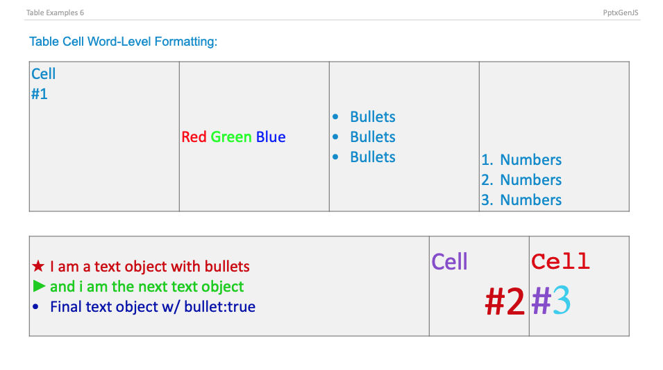
Samples
Runnable C# samples: see the Usage Examples section of this site.